Event Organizers, Marketers, and Owners | 7 minutes

Virtual events are no longer just a replacement for physical meetings. Today, they’re the lifeblood of the industry, giving organizations the ability to network, skillshare, and educate on a global scale—without the need for expensive and polluting flights, conference centers, or hotel rooms. Since 2020, virtual events have witnessed a 400% increase in market share. While there’s never been a better time to engage your network, it’s also becoming increasingly tricky to gain reliable registrations and attendees as the events space grows more competitive and crowded.
Delivering a great virtual event means delivering a great virtual event experience, beginning with its very first touchpoints: the event’s landing page and registration page.
UX experts estimate that you have roughly 15 seconds to capture someone’s interest with a landing page before they bounce. What this means is that if you want to drive conversions, your landing page needs to pop. This is where you’re going to give prospective attendees a taste of the tone and content of the event, whether that’s through eye-catching visuals or testimonials.
Doing so will help ensure you can push as many people as possible toward your event registration page. This is an absolute necessity so that your attendees can sign up in a quick, painless way. Getting this right not only means that people will be able to attend, but it also plays a critical role in generating the most valuable asset of all: data.
Whether you’re building separate landing and registration pages or combining them into one, let’s take a look at why these digital assets are so important—and what you’ll need to do to turn curiosity into conversions.
What’s the point of a landing page?
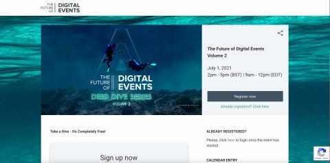
Put simply, a landing page is a specific web page separate from your homepage and your site content. It’s dedicated to a single purpose or product — in this case, your virtual event — and it’s where you make the case to visitors for becoming a participant.
A virtual event landing page serves two purposes. Firstly, it gives prospective attendees the chance to get to grips with an event and gain enough information to decide about attending.
That means not only selling them on the event agenda, but giving them all the details they need to attend. Successfully doing so is what enables you to fulfill the page’s second purpose: convincing visitors to hit up your registration page.
There are three levels to a landing page that make it a useful funnel for registrations and conversions.
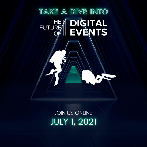
First impressions are the most important. From a single glance, visitors need to get a feel for the broad content, tone, and voice of the virtual event. That means working closely with your designers to make the top of the page visually appealing while communicating the key information concisely:
- The event title
- Time and date
- Topics and key takeaways
- Speakers
- Industries represented
Including the time and location of the virtual event at the top of the page is also useful.
Once you’ve caught their attention, the next questions on your visitors’ minds will be about the specifics: who will be speaking, what the agenda and format will be (i.e. keynotes, panels, or fireside chats), and the key takeaways to expect.
So, your next section is an opportunity to highlight the USPs of your event, whether that’s through the exclusivity of the speaker lineup or the learnings obtained. You can also include some speaker pictures and bios. Padding these out with quotes or testimonials about previous events can give your virtual event added legitimacy, and show you mean business.
Graphics can be really useful here to illustrate why your event is important, such as by showing the increasing relevance of your topic or its importance as a concern in the industry. Ultimately, what you’re aiming for here is the hook effect—turning interest into enthusiasm.
Your landing page should ideally conclude with the finer details. A detailed invitation and event description with around 100-150 words of copy should be enough, as well as information on pricing, how to attend, and finally, a call to action for your registration page.
Why make a registration page?

So you’ve made a jaw-dropping landing page that’s not only sold the event to your visitors but given them all the information they need to attend. Now they want to sign up.
Your registration page is the most important conversion tool in your arsenal. If you pull it off right, it can help guarantee both signups and attendance, as well as help you capture lots of vital user data.
That means making your registration page as streamlined and user-friendly as possible.
The top of the page should briefly remind attendees of the name, purpose, and timings of the event, but keep it short and sweet. You need to define the value proposition of the virtual event very clearly but without it being a straight repetition of your landing page.
Then, it’s down to the registration process. Now, you’re going to want to gather as much data with your capture form as is useful, but you need to balance this with the need for an easy user experience.
Asking users for their name, job title, company, and email address is usually the bare minimum for virtual event registration. However, this is also a good opportunity to gain some free insights into what prospective attendees are looking for in an event.
To keep things simple, a multi-option drop-down menu listing some reasons why they’re attending is a great way to quantify this. For example, asking for the topic they’re most interested in or the information they’re after can help inform contact further down the line.
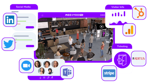
Of course, this should not be too unwieldy, so balancing it with an easy sign-up process is key. Many registration pages use single-click registration (SSO) which lets people sign up by logging into their email or social channels. It’s also worth remembering that you can integrate your registration forms into your CRM. This will let you centralize all the captured user data as well as make it easier to send follow-ups and reminders to your attendees closer to the event itself.
To wrap things up, make sure your attendees get a short and sweet confirmation email to let them know when and where they can attend. It’s worth including a button here to let them add the event directly to their calendar, including a link.
You can also include a few fun little Easter eggs about the benefits of signing up for the event. As part of our decarbonizing event initiative, MEETYOO provides a CO2 dashboard that informs your visitor how much energy they are saving by attending your event virtually. The user can use it to understand the emissions that would have been produced by physically attending an event.
Conclusion
More than ever, event organizers and marketers need to deliver a seamless sign-up process that not only captures visitor data but visitor attention.
Your landing and registration pages aren’t just the narrow end of your conversion funnel; they’re the start of your visitors’ event experience and should be treated as such.
If you really want to convince someone that your virtual event is worth attending, it starts with these pages. They need to be as high-quality and well-presented as the event itself, providing your attendees with an end-to-end user experience that feels polished, powerful, and respectful of their time and effort.
Getting it right will mean not only lots of engaged attendees for your event, but hopefully, new contacts and customers who will return to you again and again for insights, events, and even products or services. Your attendees are putting their trust and data in you—so make sure you honor them with a brilliant experience and a reason to follow up.
If you’re looking for an easy-to-use registration or landing page, MEETYOO solutions include fully tested and optimized page templates. Speak to us today for more information.
Learn more about our immersive virtual events.
Speak with the experts on our team on how to start your new immersive digital event venue.
