
Event Professionals and Marketing Experts | 3 minutes
Increase Attendee Engagement By Simplifying Your Virtual Event Design
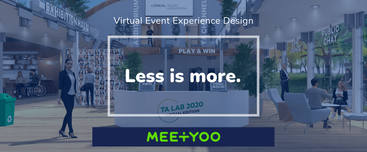
In an attempt to boost attendee engagement event planners may add features and program content. However, for most virtual and hybrid events, less is more.
The more content and feature clutter an event has, the harder it is to navigate. No one likes clutter. Each space in your virtual event should have its own clear purpose.
This is also true for your agenda. A well thought out agenda provides attendees with many opportunities to engage, learn, and be inspired. But when conversations are dragged out, or you have “dead air” (where nothing is happening), your attendees’ patience is being tested.
Your attendees only need one click to leave your virtual event if their time is not being used effectively. This is a fundamental difference between virtual and in-person events.
- Always keep your remote audience’s limited attention span in mind.
Design your program to be clear and concise, with strict time limits on speaker presentations.
- Direct your audience deliberately.
A group of strangers can come alive around a designated topic they care about. But the same group will find a free-for-all networking session awkward if its purpose and etiquette isn’t clear.
- Avoid overcomplicating your virtual and hybrid events.
You don’t want your attendees to feel lost or overwhelmed by unnecessary options. Great design is a result of careful deduction.
Only what attendees need is there, helping them focus and navigate your venue effortlessly.
A simple and clear event design is just one of five strategic experience design considerations that
we’ve outlined in our Virtual Event Experience Design eBook. Download your free copy to boost attendee engagement for your virtual event.
Create Higher Engagement for your Virtual Events
Download your free copy of our eBook to boost attendee engagement for your virtual event.

